Showing posts with label Magazine adds. Show all posts

Monday, 4 January 2016

Magazine advert: draft 3

Magazine advert third draft
How I have developed
Font and text
In my last draft I did not use the cut out font however in this one I have brought it back as I have had a lot of positive feedback on it. I wish to expand on it further though. Again I have kept minimal text on the poster but have added website to direct fans to the website to find out more about the supposed upcoming tour dates which will accompany the new album. This is because nowadays a bands highest profit comes from their live tours therefore we would want to also promote and hype this up along side the album. 
The bands name is in a larger text compared to the album name which follows the conventions of a magazine advert, however I don't feel as if this is as effective. When the larger focus text was Captive city it is more eye catching and ultimately enhancing the adverts appearance.  
Effects
I have also added a dulling effect to the image from photoshop to enhance the Indie feel of the advert and therefore help to bring across the bands persona. 
Colour
The colour of Captive city is a salmon pink colour which I have chosen as it complements the image and also links to the bands running theme of pink on their website. It is seen as their signature colour.
Sly antics use pink on their website
Image choice
I have again chosen to use this image as it it quite striking as the band are all looking in the same direction in sync. Also the light is shining onto their faces which draws your attention to them. It also has a darker side which is good for adding lighter text on to and creates an atmospheric mood which is a common trait used in the indie genre. 
  

Magazine adverts: near final drafts

Near to final drafts
At the moment these are my final drafts of my 2 teaser magazine adverts and the main magazine advert, but I will ask for audience feedback and hopefully develop on them further. 


Main magazine advert


Second teaser advert
First teaser advert

Influences: Digipak and mag advert 1

Influences 
Arctic monkeys:
The Arctic monkeys plain black and white approach inspired my original teaser adverts however I have built upon them over several weeks and have now taken another approach using their other signature style of cutting the bold text out of an image in this cast a psychedelic pattern. This is very fitting with the Indie genre as many other bands have used this approach therefore our poster will be fitting with our chosen genre. 

Arctic monkeys - Do you wanna know- art work inspiring my later drafts

Arctic monkeys - Do you wanna know- art work inspiring my first draft

Arctic monkeys - Do you wanna know- art work inspiring my first draft
 The 1975:
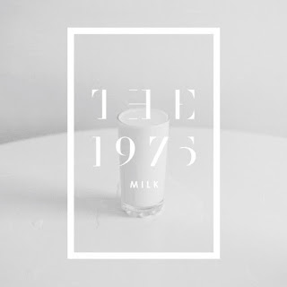
The 1975 have also influenced my art work. Again similar to The arctic Monkeys they have a very well know simple stylised approach which is now their signature trademark and is well recognisable. I also have tried to create a running trend through out my work by using the same bold fonts and a trend in the images, the trend being that they are all possess a  grainy effect created as they are screen shots of film footage I have taken adding to the retro and therefore indie feel as well as extra effects found on the photoshop filters. I hope that this achieves the same effect and that all the art work is interlinked. My running trend throughout my artwork is also the reoccurrence of the low levels of opacity used. This is used in all my art work and helps to blend the sharp lines of the text and image that are placed on top of each other. Also creating a hazy effect which can also be seen in the 1975s art work bellow. Again the 1975 have cut the text out of the image as I have how ever I have layer together separate multiple images. 

 As you can see in the art work below again they have used the opacity to create a hazy effect but this time not with the text but with the images themselves. I have also done this with my images as I have layer multiple images on top of each other including images of lights with I have used as the base layer and by lowering the opacities of the upper layer shines through to create an indie approach to an other wise simple photo. 


Friday, 27 November 2015

MOODBOARD: magazine ad and digipak

Moodboard 
Using conventions of an indie approach to images I want to create a grungy look to our magazine ad and digipak using maybe black and white to follow these conventions as well as creating a link between all three pieces of work (Digipak, mag ad and music video) 
Using images of rough urban areas it helps to create a grungy retro feel. (look on this blog post to see actual examples of digipak who have used this approach) 


Wednesday, 25 November 2015

TESTING: teaser advert test 2

Magazine advert
Using photoshop I played around with trying to create a simple poster to be used with in our music video. In these I used images taken from footage we had previously taken and added some effects to make them look more grungy to fit with the bands style. As a posters main focus is the information I made sure that it was bold and visible from afar. 
Next
Next I will need to try develop these using illustrator which i have just been introduced to. This will help with the pixelation of the text and images.
Influenced by:
Again these simple images are influenced by fellow indie bands such as the arctic monkeys and 1975 who use very simplistic and stylised images with minimal to no text included. 
Arctic monkeys - Do you wanna know- art work


Friday, 20 November 2015

Magazine adverts: draft 1

Rough teaser advert drafts
After playing around with the new cutout font I have over layer these with one or multiple images which after lowering the opacity has create one larger image. The faded image fits with the Indie genre due to the unfocused effect seen in many of The 1975's art work.
The 1975 art work
 However the image its self is not good enough quality to enlarge it any more as it is a screen shot and so not big enough to be a magazine ad. So I tried layering it on top of another larger image and then lowering the opacity. The finished product is not very good but I needed to see the effect created to then expand on it. This is a very rough first draft.
The text and how I will progress
As this is a teaser advert it will have minimal text on it so my next draft will contain the release date of the Digipak/album with I have decided will be the 30.09.16 as it is around the end of this year and the album title Captive city. As the poster will not be giving much away it will create hype surrounding the band and its new material.                               
Audience feedback
After receiving audience feedback they said that they liked the layers but that they didn't like the shadowing of the numbers or the fabric like effect. 


Saturday, 14 November 2015

FONTS: genre examples

Font examples
All of these examples are from indie bands magazine adverts. All show very simplistic fonts which I like. As sly antics also fall within the same genre we can follow this trend. For example the Manic street preachers have flipped the R in one of their ads indicating the alternative nature of the band. Also the colours are quite dulled in most of the examples which denotes a more serious genre. The use or art work in one advert again works very well to indicated their arty alternative approach. Each are very simplistic and are very pleasing to the eye as they are so stylised


IDEAS: magazine ad general images

Focus of magazine ad
From research I know that the main focus of the ad must be the digipak as that is what we are advertising, therefore I must include an image of the digipak on at least on of the ads. This could show the extras e.g. a DVD or lyric booklet
Rhianas digipak showing extra CD or DVD and lyric booklet


Secondary focus
However magazine ads are not just about promoting the album but also their up coming gigs and merchandise as these aspects are becoming one of the biggest ways that bands make a profit. Therefore another idea could be too add pictures of band T- shirts or live gig images to help show off the bands tour experience and helping with ticket sales. 

libertines ad showing live gig images and advertising gig dates
The contents also depends on whether we are designing a full page or 1/2 page advert. I could be less generic and create an image that links to our music video. I could also create a second ad to put in another magazine that appeals to a secondary audience


IDEAS: Magazine text ideas

Text ideas for magazine ad
After my research into magazine ads I've decided to add all of these text aspects onto my magazine ad to make it as realistic as possible:

  1. List DVD and or special edition extras
  2. Tour dates and website to purchase tickets
  3. release dates of album (digipak)
  4. bands social media and URLs (twitter and instagram hashtags and Facebook)
  5. official website
  6. record company
  7. DVD logo
  8. reviews from other artists, magazines etc 
  9. brief description


Viral idea: Magazine and digipak idea

Viral idea
To take our magazine ad and digipak to the next level we are considering creating a scheme where fans of the band will take a photo of the bands poster in venues that they want the band to play in for example local bars, and then hashtag #slyanticsplayhere and post it on the social media site of their choice e.g. instagram, twitter or Facebook. This will help us when creating our digipak and magazine ad as we can incorporate these photos.

Friday, 23 October 2015

Brand Media Kits - Audience Research Mag Ad

Brand Media Kits - Audience Research Mag Ad

Q MAGAZINE - Brand Media Kit

Their publishers, Bauer, created a Brand Media Kit PDF with reader profiles, demographic data and also talks about their access to big names in the business, their audience breadth, and their online and digital additions of their magazine. 


This screenshot from the pack denotes an average reader of their magazine to identify to possible advertisers the type of audience that reads their magazineQ is a very male and older readership with more intellectual people reading as signified by their demographic information.


INDIE CHICK MAGAZINE - Brand Media Kit
Their magazine is solely based on women as their readers and had their own Brand Media Kit they specify that they want to help out and advertise companies and different things that would link to what they write about.

With this demographic data in mind, I think that this would be a good choice to promote Sly Antics to our secondary female audience.

Friday, 9 October 2015

VLOG: General conventions of magazine adverts

General conventions of magazine adverts

COSTS: General conventions of magazine adverts

General conventions of magazine adverts 
As adverts vary in size so does the price, the bigger the advert the larger the cost.
The whereabouts of the advert is also vital to its price as if it is printed on the inside of the back or front page it is at its most pricy. Another thing to consider is what our main target audience is and which magazine genre would be most suited to publicising our artist. However it is also a good idea to place smaller adds in alternative magazines to appeal to a secondary audience.
A good website to check out costs of placing adverts in magazines is Small businesses.
It states that 
at the time of publication, a national woman's lifestyle magazine charged nearly $250,000 for a full-page ad while a niche gardening magazine only charged about $10,000.
Positioning
Inside the front cover, inside the back cover and the back cover are prime advertising spaces. A West Coast magazine at the time of publication charged $141,800 for the inside front cover, for example, while a full-page ad cost $118,400. Advertising toward the front of the magazine costs more than toward the back of the magazine, with the exception of the back cover. The magazine may demand that the ads towards the front are a minimum size, perhaps full or half-page only.