Showing posts with label Photoshop. Show all posts

Sunday, 17 January 2016

DIGIPAK: panel 1 edit 4

Panel 1 edit 4
I really like the main image on the front cover as it shows all of the band members in an interesting light. Its unconventional as the lead singer is not the main focus but I like that as the indie genre is known for breaking the normal conventions as stepping outside the box much like Blur and The Strokes (I have previously blogged on this). Therefore I will not change this image as I have already gained a lot of positive audience feedback on it. 
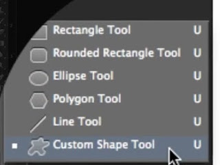
What I have done: I have moved the bonus dvd footage sticker on to the front cover. I have made this my self in photoshop. I simply typed the text and placed it on top of a rounded rectangle which you can create through the round rectangle tool. I then used the eraser tool and played around with it's different brush sizes and types and found one that created a distressed effect. I have now moved this on to the front. In order to do this though I have had to move the Sly Antics text to the left. I used pre-made example of bonus footage stickers to create mine to make it as realistic as possible. 
 (Tutorial I used)
Next: I may make the Sly Antics text larger as it is indistinguishable as it is so small. 

DIGIPAK: panel 1 edit 3

Panel 1 edit 3
I really like the main image on the front cover as it shows all of the band members in an interesting light. Its unconventional as the lead singer is not the main focus but I like that as the indie genre is known for breaking the normal conventions as stepping outside the box much like Blur and The Strokes (I have previously blogged on this). Therefore I will not change this image as I have already gained a lot of positive audience feedback on it. 
What I have done:
I have played around with the brightness levels of the text using the tools in photoshop and illustrator. I thought that the text looked a little dull and didn't stand out enough.
Next: I may change the brightness back as I feel like it ruins the overall grungy effect of the front cover. I will play around with the ordering of the panel.

Monday, 4 January 2016

PHOTOSHOP: magazine advert cut out fonts 1


Photoshop to create cut out text
Inspiration
After being inspired to use the font Helvetica Neue by the 80's LA alternative venue "the clash" art work inspired from a classic Swiss design below, I then wanted to develop on it further so I came across an image of cut out text in an indie style advert using the same text but having it be a cut out of another image. 
Indie style avert


Creating a link 
So to create a link between the advert and music video I used the idea of the bag mans straw sack mask. If overlaying this on an image it looks almost like we are seeing the image from the bagman's perspective adding another dimension to the art work. 
Photoshop 
I transferred the sack effect to photoshop and using this photoshop tutorial  


I managed to cut out the release date I have decided upon out of the straw material which I can then layer on top of another image. 
Step one type the date
The date in the straw material 
The date cut out of the straw material. 


Tuesday, 15 December 2015

First draft of digipak

First draft of digipak front cover
Using photoshop and illustrator I have created the first digipak front cover. 
Photoshop
I have cut out the image of the 3 band members in masks using the polygonal lasso tool and then desaturated the image and using levels and curves tool, I have found the right dark black and white option for me. I then faded the edges of the image to make it blend better with the background. 
I then transferred my image, which I took using long exposure on my camera and desaturated it again and using the levels and curves tool, I made the backdrop almost black and the light white to create more of a contrast. I then duplicated the image and flipped it vertically and merged the two images together to create one large image to create the background. I then transferred the image onto the background. 
original background image
Illustrator 

As I already had a template for the digipak so to make sure the image went all the way to the bleed (the blue line) I worked out how long the image would have to be to fill the front and back covers. This measurement was 291mm by 131.5mm. 
I then found the font CFJackStory in the font book which looks almost hand written which fits very well with the indie genre as its freehand. Also to help fit with Sly Antics style I used the salmon colour they use repeatedly on their website. I did this by copying a screenshot of the font and using the dropper tool copied the exact colour. I then typed out the bands name and the albums name. To fit the genre conventions I made the bands name larger than the album name. 

Saturday, 28 November 2015

MISE-EN-SCENE: Another Poster of Sly Antics

MISE-EN-SCENE: Poster of Sly Antics


This is the poster I created using Photoshop, it will be used in the first an last shot of our video. I will also create duplicates of this to create verisimilitude.

PHOTOSHOP: long exposure

Using photoshop to create the effect of long exposure on a camera 
Instead of changing the settings on a camera to create the effect of long exposure you can do it very quickly using photoshop. Here is a video explaining how:


(messy example with time and care it will be a lot neater)
Before 
 After


Another attempt at different image:


Wednesday, 25 November 2015

TESTING: teaser advert test 2

Magazine advert
Using photoshop I played around with trying to create a simple poster to be used with in our music video. In these I used images taken from footage we had previously taken and added some effects to make them look more grungy to fit with the bands style. As a posters main focus is the information I made sure that it was bold and visible from afar. 
Next
Next I will need to try develop these using illustrator which i have just been introduced to. This will help with the pixelation of the text and images.
Influenced by:
Again these simple images are influenced by fellow indie bands such as the arctic monkeys and 1975 who use very simplistic and stylised images with minimal to no text included. 
Arctic monkeys - Do you wanna know- art work


TESTING: Teaser poster test 1

First draft of magaziene advert
This is a very rough edit I created on photoshop using screen shots of my previous filmed footage. As the quality of the image wasn't very good I using the effects tool added this complete black and white effect. This very simplistic approach was inspired by the Arctic Monkeys past art work. Both use straight black and white colouring and only simple lines. Also as this was intended to be a simple teaser advert I added minimal text/information in order to create hype and mystery behind the upcoming Sly Antics album. 


Arctic monkeys - Do you wanna know- art work

Arctic monkeys - Do you wanna know - art work