Showing posts with label Digipak. Show all posts

Sunday, 17 January 2016

DIGIPAK: panel 2 edit 3

Panel 2 edit 3
Taylor Swift '21'
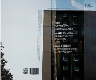
I wanted to keep this panel relatively simple as the track list would need to be the main feature and all the other example I have looked at have kept theirs very simplistic e.g Taylor Swift. Therefore I have chosen an image of city buildings to carry on the city theme which links back to the album title 'Captive city'. I have created slight cross over layering with the images on the first panel (the images on the first panel cross over to the second). This is an effective look as it adds to the grungy feel due to the difference in textures and colour shades. 
What I have done: I have moved the bonus sticker back on to the back because due to audience feedback it didn't look right on the front panel as it looked out of place. 
Next: I am quite happy with how it looks at this point minor tweaks might be made but nothing drastic. 

DIGIPAK: panel 2 edit 2

Panel 2 edit 2
Taylor Swift '21'
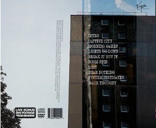
I wanted to keep this panel relatively simple as the track list would need to be the main feature and all the other example I have looked at have kept theirs very simplistic e.g Taylor Swift. Therefore I have chosen an image of city buildings to carry on the city theme which links back to the album title 'Captive city'. I have created slight cross over layering with the images on the first panel (the images on the first panel cross over to the second). This is an effective look as it adds to the grungy feel due to the difference in textures and colour shades. 
What I have done:
I have moved the small print inwards and the bonus footage sticker on to the front panel as it is a key selling point it needs to be noticeable so it will be easier to see on the front, therefore boosting sales. 
Next: I will carry on playing with the ordering.

DIGIPAK: panel 2 edit 1

Panel 2 edit 1
Taylor Swift '21'
I wanted to keep this panel relatively simple as the track list would need to be the main feature and all the other example I have looked at have kept theirs very simplistic e.g Taylor Swift. Therefore I have chosen an image of city buildings to carry on the city theme which links back to the album title 'Captive city'. I have created slight cross over layering with the images on the first panel (the images on the first panel cross over to the second). This is an effective look as it adds to the grungy feel due to the difference in textures and colour shades. 
What I have done: I have chosen a different font for the track list as I have used the same font for all the other font and I wanted to create diversity in my use of fonts. I have chosen Type font (Typewriter style font) as this fits with the retro and alternative feel of the digipak. I have included all of the general conventions of a digipak e.g small print (I took inspiration from the Blur and Strokes CD small print), distributors/music label (I chose Virgin music as they have artists like The cult and Thirty seconds to Mars fellow indie/rock artists, also Sly antics have an interview with virgin music to possibly get signed so it is fitting with reality), Bonus footage sticker (I have previously blogged on how I made this) DVD and Disco logos as well as a Bar code
Next: I will change the ordering of the panel.

DIGIPAK: panel 4 edit 3

Panel 4 edit 3
I want to carry on the grungy feel of the previous panels therefore I have chosen the dark coloured image of the three chairs as it looks eery, I also want to add song lyrics like on panel 3 to create a link between the two.
What I have done: I have added more layers. I have cut and cropped sections of the origional image and layered them on top of each other to again build upon the eery feel and grungy nature of the panel
Next: I might play around more with the text, but so far all I have received is positive feedback on this panel so I might keep it the same. 

DIGIPAK: panel 4 edit 2

Panel 4 edit 2
I want to carry on the grungy feel of the previous panels therefore I have chosen the dark coloured image of the three chairs as it looks eery, I also want to add song lyrics like on panel 3 to create a link between the two.
What I have done: I have added a third image and again lowered it opacity, this creates a link between the digipak and the music video as well as the magazine adverts as they all include an image of the bagaman. 
Next: I will carry on layering images. 


DIGIPAK: panel 4 edit 1

Panel 4 edit 1
I want to carry on the grungy feel of the previous panels therefore I have chosen the dark coloured image of the three chairs as it looks eery, I also want to add song lyrics like on panel 3 to create a link between the two.
What I have done: In Indesign where I piece all the elements of my digipak together I also created the 4th panel. Basically I layered two images on top of each other on of the chairs and one of the band with their backs to the camera looking at the chairs. I them lowered the opacity of the top layer which was the band members to the chairs were revealed as well the lamp in the band picture is brought across as well, this is intentional as the band have used this lamp in many of their other promotional images therefore it will help create a link between their work and ours. 
I then added text on top to again create the link between the inside panels to follow the general conventions. As there is minimal lighting in the image I thought I would use a quote that directly related to light so I chose "Will you be waiting when the sun goes down". 
Next: I will add more layers to add to the eery effect. 


DIGIPAK: panel 1 edit 4

Panel 1 edit 4
I really like the main image on the front cover as it shows all of the band members in an interesting light. Its unconventional as the lead singer is not the main focus but I like that as the indie genre is known for breaking the normal conventions as stepping outside the box much like Blur and The Strokes (I have previously blogged on this). Therefore I will not change this image as I have already gained a lot of positive audience feedback on it. 
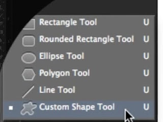
What I have done: I have moved the bonus dvd footage sticker on to the front cover. I have made this my self in photoshop. I simply typed the text and placed it on top of a rounded rectangle which you can create through the round rectangle tool. I then used the eraser tool and played around with it's different brush sizes and types and found one that created a distressed effect. I have now moved this on to the front. In order to do this though I have had to move the Sly Antics text to the left. I used pre-made example of bonus footage stickers to create mine to make it as realistic as possible. 
 (Tutorial I used)
Next: I may make the Sly Antics text larger as it is indistinguishable as it is so small. 

DIGIPAK: panel 1 edit 3

Panel 1 edit 3
I really like the main image on the front cover as it shows all of the band members in an interesting light. Its unconventional as the lead singer is not the main focus but I like that as the indie genre is known for breaking the normal conventions as stepping outside the box much like Blur and The Strokes (I have previously blogged on this). Therefore I will not change this image as I have already gained a lot of positive audience feedback on it. 
What I have done:
I have played around with the brightness levels of the text using the tools in photoshop and illustrator. I thought that the text looked a little dull and didn't stand out enough.
Next: I may change the brightness back as I feel like it ruins the overall grungy effect of the front cover. I will play around with the ordering of the panel.

DIGIPAK: panel 1 edit 2

Panel 1 edit 2
I really like the main image on the front cover as it shows all of the band members in an interesting light. Its unconventional as the lead singer is not the main focus but I like that as the indie genre is known for breaking the normal conventions as stepping outside the box much like Blur and The Strokes (I have previously blogged on this). Therefore I will not change this image as I have already gained a lot of positive audience feedback on it. 
What I have done:
I have changed the image behind the text of the bagman and centred it as I had negative feedback saying that it created less impact and made the panel look messy.
Next: I will play around with the text.


DIGIPAK: panel 1 edit 1

Panel 1 edit 1 
I really like the main image on the front cover as it shows all of the band members in an interesting light. Its unconventional as the lead singer is not the main focus but I like that as the indie genre is known for breaking the normal conventions as stepping outside the box much like Blur and The Strokes (I have previously blogged on this). Therefore I will not change this image as I have already gained a lot of positive audience feedback on it. 
What I have done:
I have lowered the opacity of the text (I have previously blogged on the Captive city text) and the image. However again I have not followed normal conventions and have made the album title the largest text rather than the stereotypical convention of the Bands name, I felt like the captive city text worked better with the overall number of letters allowing me to use this text size and font and keep it over the same of 3 lines and that it was more striking. This is also the same for the magazine adverts. It also allows me to create a wider meaning as I wanted the digipak to reflect the album title 'Captive city' and by creating the text captive city out of an image of a city building (representing a city) the city would be trapped within the text much like the phrase 'captive city'. This theory has again been used in the magazine advert, this also creates a link between the magazine advert and digipak
I have then added an image of the bagman to again create a link between the music video and the digipak I have faded the opacity on this as well. 
I have also layered another photo of lights underneath the main image to create a faded and graded feel as I have slightly lowered the opacity of the top image so you can only just see the beams of the lights this carries on to panel 2 to create a layered effect, I feel like this adds to the grungy indie feel of the font cover. 
Next: I will centre the image of the bagman behind the text.

Image that is layered underneath 

DIGIPAK: pannel 3 edit 5

Pannel 3 edit 5
I want to use photos of the band on the inside panels so I have screen shot these images which I have then cropped down and shrunk
What I've changed:  I felt like the colours are too strong and needed dulling down to fit the tone of the other panels so I lowered the opacity of the images. 
Next: Due to audience feedback I might play around with the colour of the images to fit the colour scheme of the other panels. 

DIGIPAK: pannel 3 edit 4

Pannel 3 edit 4
I want to use photos of the band on the inside panels so I have screen shot these images which I have then cropped down and shrunk
What I've changed: I have altered the font of the text, I have chosen the font that I have used for the rest of the text on the magazine advert and on the front panels of the digipak because I feel like this is more suited to the genre as it is more straight edged and grungy as well as creating a definite link between the magazine advert and digipak. I have also changed the texts content as I have swapped the description of the band for some of the bands song lyrics. I felt as if this would be better suited as it is a common convention used by all genres. I chose stand out lyrics that would add to the grungy feel of the digipak, this is also to give a taster for whats to come on the album. 
Next: I feel like the colours are too strong and need dulling down to fit the tone of the other panels. 


DIGIPAK: pannel 3 edit 3

Pannel 3 edit 3
I want to use photos of the band on the inside panels as well as images of them wearing the masks so I have screen shot these images which I have then cropped down and shrunk. I have included images from the back and front as I think that it will help the overall interest of the ascetics of the panel
What I've changed: I have kept the text the same however, much like other indie bands e.g. Blur, I have used images of all the band members. I think this is a more conventional approach and fits the genre style more. 
Next: I think it is too plain and I don't feel like the font of the text reflects the genre and a more straight edged font would be more suitable. I also think that song lyrics would be better suited as this is a common convention used by all genres.

DIGIPAK: pannel 3 edit 2

Pannel 3 edit 2
I want to use photos of the band on the inside panels as well as images of them wearing the masks so I have screen shot these images which I have then cropped down and shrunk. I have included images from the back and front as I think that it will help the overall interest of the ascetics of the panel
What I've changed: In this edit I have added another image on top, I did this by sending the other layers to the back when clicking on the object, I have then lowered  the opacity of all the images to merge them together to create one image. I thought however that I looked quite plain and wanted to add some extra information about the band, I did some research on Sly Antics website and found their bio describing their style and image "We are Sly Antics. Two cousins and a taller man called Tommo. We want to make a nest in your ears, settle down and shout absurd things to you whilst you attempt to carry on about your day as if we’re not there." 
II then found an interesting type font which I then turned half black and then highlighted the bands names in the text by making it pink. This links to the bands website as they use the colour pink a lot as well as the combination of pink and black. 
Next:
Its quite difficult to make out the text, however I am still not happy with the edit and I want to include the bands faces more so I intend to use more images that will make the inside more personal. 


DIGIPAK: pannel 3 edit 1

Pannel 3 edit 1
I want to use photos of the band on the inside panels as well as images of them wearing the masks so I have screen shot these images which I have then cropped down and shrunk. I have included images from the back and front as I think that it will help the overall interest of the ascetics of the panel
Next:
I will add some over laying images to complete the edit and play around with the colouring of the images in photoshop.


Saturday, 16 January 2016

DIGIPAK DRAFT

Digipak draft
This is basically exactly the same to my most recent draft however I have altered the front image text slightly by using the cut out effect taken from mesh cloth. This directly relates back to the music video as the main feature is the mask man who also wears a mesh mask. 

Monday, 11 January 2016

Audience feedback: Digipak 2

Audience feedback post 16 student (Lucy)

1. What genre do you think the digipak is aimed at?
-Indie/house
2. What do you like about it?
-Layering, it grabs your attention, large font and likes how the back, front panels correlate as well as the lyrics on the inside panels.
3. Does it look professional?
-yes but the cover looks the most professional.
4. What could be improved?
- All the text should be in the same font also the inside first panel could also link to the city like the rest of the panels.

Sunday, 10 January 2016

DIGIPAK: Song titles/track list

Song titles
As Sly antics only have 5 songs, as you can see on their Soundcloud list below, I had to add a few extra tracks as 5 songs would not fit the normal convention of around 12 tracks.
Track convention
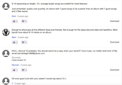
I researched how many tracks would usually be on an album, this varies but only using example from the indie/rock genre I have concluded upon 10 tracks. Even though usually these bands would have 12 tracks as this is Sly antics first album I feel like 10 is more suited as the band is new and the examples I have picked are from a bands 4th or 5th album not their first like Sly antics. These examples are the Arctic Monkeys who have 12 and The Kooks who have 11 tracks. I also looked at online forums to see what other peoples opinions were on the amount of tracks on an album. Most people said around 10 a few said between 8 and 14 so I feel that 10 tracks is a good mid point. 
Online forum

Arctic monkeys 12 track list

The Kooks 11 track list
Extra song names
I have chosen to add 5 extra tracks and name them after titles inspired by songs of the same indie/rock genre. These are inspired by Discharge songs such as 'Hear nothing,see nothing, say nothing', 'Does the system work' and 'Religion instigates' I felt like these new song titles fit the same pattern as Sly Antics original tracks as they are grungy and dark.                                                                  
Track font and colour
To carry on Sly antics signature style of using pink and grey together I made the text pink and grey to fit with their style. Even though the colour pink may not be fitting with the indie/rock genre it fits with the bands already existing online presence as seen in my past posts on their website. Also I used a grungy type font to again fit with the bands pre existing image and I also felt as if this worked well with the aesthetics of the Digipak. Again for the numbers I used a hand writing font to make it look scruffy and worn to fit with the signature rough look associated with the genre. I have also made all the text bar the a's capitals to add something extra to the track list it makes it unique and different to fit with the indie genre. 
                          
Sly Antics 10 track list on the Digipak

Monday, 4 January 2016

Digipak near final draft

Near final draft Digipak
This is after I have put all the panels together I will ask for some audience feedback and hopefully develop it further.

PHOTOSHOP: magazine advert cut out fonts 2

Progressing on previous font design
How I have developed my idea
I have now developed my previous font design however still using the same font Helvetica Neue I have moved on from the straw idea but have now used screen shots taken from my footage and layered them on top of each other.
The new developed idea
To create a link between the song/music video and the mag advert and digipak I used the cut out font to portray the country side and the city. So as the title of the album is Captive city the text incorporates an image of the city, so a run down building as seen below. This is then layered on top of a natural image to represent the countryside. 


The image of the countryside surrounds the image of the city and therefore traps it much like the text which is trapping the image of the city unlike nature which is not confined to be the the shape of the text. This therefore links to the album title captive city as the city is being captured/restrained within the art work. The opacity is lowered to help the two images blend together.


Alternative images
I have also done this to a number of other images to create different effects. 
The bagman being inside the text makes him look very daunting and scary linking back to the intimidating portrayal of his character in the music video carrying on this scary image. He looks like is is peeking at the viewer through the text whole again linking to his stalker role in the video. Maybe the bagman is captive to the city.