Showing posts with label Font. Show all posts

Sunday, 17 January 2016

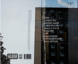
DIGIPAK: panel 2 edit 1

Panel 2 edit 1
Taylor Swift '21'
I wanted to keep this panel relatively simple as the track list would need to be the main feature and all the other example I have looked at have kept theirs very simplistic e.g Taylor Swift. Therefore I have chosen an image of city buildings to carry on the city theme which links back to the album title 'Captive city'. I have created slight cross over layering with the images on the first panel (the images on the first panel cross over to the second). This is an effective look as it adds to the grungy feel due to the difference in textures and colour shades. 
What I have done: I have chosen a different font for the track list as I have used the same font for all the other font and I wanted to create diversity in my use of fonts. I have chosen Type font (Typewriter style font) as this fits with the retro and alternative feel of the digipak. I have included all of the general conventions of a digipak e.g small print (I took inspiration from the Blur and Strokes CD small print), distributors/music label (I chose Virgin music as they have artists like The cult and Thirty seconds to Mars fellow indie/rock artists, also Sly antics have an interview with virgin music to possibly get signed so it is fitting with reality), Bonus footage sticker (I have previously blogged on how I made this) DVD and Disco logos as well as a Bar code. 
Next: I will change the ordering of the panel.
Monday, 4 January 2016

PHOTOSHOP: magazine advert cut out fonts 2

Progressing on previous font design
How I have developed my idea
I have now developed my previous font design however still using the same font Helvetica Neue I have moved on from the straw idea but have now used screen shots taken from my footage and layered them on top of each other.
The new developed idea
To create a link between the song/music video and the mag advert and digipak I used the cut out font to portray the country side and the city. So as the title of the album is Captive city the text incorporates an image of the city, so a run down building as seen below. This is then layered on top of a natural image to represent the countryside. 


The image of the countryside surrounds the image of the city and therefore traps it much like the text which is trapping the image of the city unlike nature which is not confined to be the the shape of the text. This therefore links to the album title captive city as the city is being captured/restrained within the art work. The opacity is lowered to help the two images blend together.


Alternative images
I have also done this to a number of other images to create different effects. 
The bagman being inside the text makes him look very daunting and scary linking back to the intimidating portrayal of his character in the music video carrying on this scary image. He looks like is is peeking at the viewer through the text whole again linking to his stalker role in the video. Maybe the bagman is captive to the city. 


Tuesday, 15 December 2015

First draft of digipak

First draft of digipak front cover
Using photoshop and illustrator I have created the first digipak front cover. 
Photoshop
I have cut out the image of the 3 band members in masks using the polygonal lasso tool and then desaturated the image and using levels and curves tool, I have found the right dark black and white option for me. I then faded the edges of the image to make it blend better with the background. 
I then transferred my image, which I took using long exposure on my camera and desaturated it again and using the levels and curves tool, I made the backdrop almost black and the light white to create more of a contrast. I then duplicated the image and flipped it vertically and merged the two images together to create one large image to create the background. I then transferred the image onto the background. 
original background image
Illustrator 

As I already had a template for the digipak so to make sure the image went all the way to the bleed (the blue line) I worked out how long the image would have to be to fill the front and back covers. This measurement was 291mm by 131.5mm. 
I then found the font CFJackStory in the font book which looks almost hand written which fits very well with the indie genre as its freehand. Also to help fit with Sly Antics style I used the salmon colour they use repeatedly on their website. I did this by copying a screenshot of the font and using the dropper tool copied the exact colour. I then typed out the bands name and the albums name. To fit the genre conventions I made the bands name larger than the album name. 

Friday, 6 November 2015

Fonts Downloading and Experimenting 5

Downloadable fonts 5
We have gathered a series of fonts to experiment with for our digipak and magazine ads. 
We will be getting audience feedback from a variety of groups mostly from our target audience. We will ask brothers and sisters, friends from school and instagram followers.  These fonts are Downloadable from the website Dafont and where under the heading Gothic modern. 
Northwood High

AmazDooM 

DragonForce

Evil Dead

Friedrich

Unrealised

Long Shot
