Showing posts with label Panel 1. Show all posts

Sunday, 17 January 2016

DIGIPAK: panel 1 edit 4

Panel 1 edit 4
I really like the main image on the front cover as it shows all of the band members in an interesting light. Its unconventional as the lead singer is not the main focus but I like that as the indie genre is known for breaking the normal conventions as stepping outside the box much like Blur and The Strokes (I have previously blogged on this). Therefore I will not change this image as I have already gained a lot of positive audience feedback on it. 
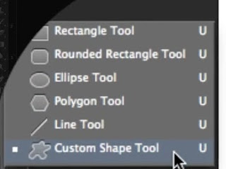
What I have done: I have moved the bonus dvd footage sticker on to the front cover. I have made this my self in photoshop. I simply typed the text and placed it on top of a rounded rectangle which you can create through the round rectangle tool. I then used the eraser tool and played around with it's different brush sizes and types and found one that created a distressed effect. I have now moved this on to the front. In order to do this though I have had to move the Sly Antics text to the left. I used pre-made example of bonus footage stickers to create mine to make it as realistic as possible. 
 (Tutorial I used)
Next: I may make the Sly Antics text larger as it is indistinguishable as it is so small. 

DIGIPAK: panel 1 edit 3

Panel 1 edit 3
I really like the main image on the front cover as it shows all of the band members in an interesting light. Its unconventional as the lead singer is not the main focus but I like that as the indie genre is known for breaking the normal conventions as stepping outside the box much like Blur and The Strokes (I have previously blogged on this). Therefore I will not change this image as I have already gained a lot of positive audience feedback on it. 
What I have done:
I have played around with the brightness levels of the text using the tools in photoshop and illustrator. I thought that the text looked a little dull and didn't stand out enough.
Next: I may change the brightness back as I feel like it ruins the overall grungy effect of the front cover. I will play around with the ordering of the panel.

DIGIPAK: panel 1 edit 2

Panel 1 edit 2
I really like the main image on the front cover as it shows all of the band members in an interesting light. Its unconventional as the lead singer is not the main focus but I like that as the indie genre is known for breaking the normal conventions as stepping outside the box much like Blur and The Strokes (I have previously blogged on this). Therefore I will not change this image as I have already gained a lot of positive audience feedback on it. 
What I have done:
I have changed the image behind the text of the bagman and centred it as I had negative feedback saying that it created less impact and made the panel look messy.
Next: I will play around with the text.


DIGIPAK: panel 1 edit 1

Panel 1 edit 1 
I really like the main image on the front cover as it shows all of the band members in an interesting light. Its unconventional as the lead singer is not the main focus but I like that as the indie genre is known for breaking the normal conventions as stepping outside the box much like Blur and The Strokes (I have previously blogged on this). Therefore I will not change this image as I have already gained a lot of positive audience feedback on it. 
What I have done:
I have lowered the opacity of the text (I have previously blogged on the Captive city text) and the image. However again I have not followed normal conventions and have made the album title the largest text rather than the stereotypical convention of the Bands name, I felt like the captive city text worked better with the overall number of letters allowing me to use this text size and font and keep it over the same of 3 lines and that it was more striking. This is also the same for the magazine adverts. It also allows me to create a wider meaning as I wanted the digipak to reflect the album title 'Captive city' and by creating the text captive city out of an image of a city building (representing a city) the city would be trapped within the text much like the phrase 'captive city'. This theory has again been used in the magazine advert, this also creates a link between the magazine advert and digipak
I have then added an image of the bagman to again create a link between the music video and the digipak I have faded the opacity on this as well. 
I have also layered another photo of lights underneath the main image to create a faded and graded feel as I have slightly lowered the opacity of the top image so you can only just see the beams of the lights this carries on to panel 2 to create a layered effect, I feel like this adds to the grungy indie feel of the font cover. 
Next: I will centre the image of the bagman behind the text.

Image that is layered underneath